Berryville Institute of Machine Learning
Logo, brand, and website design.
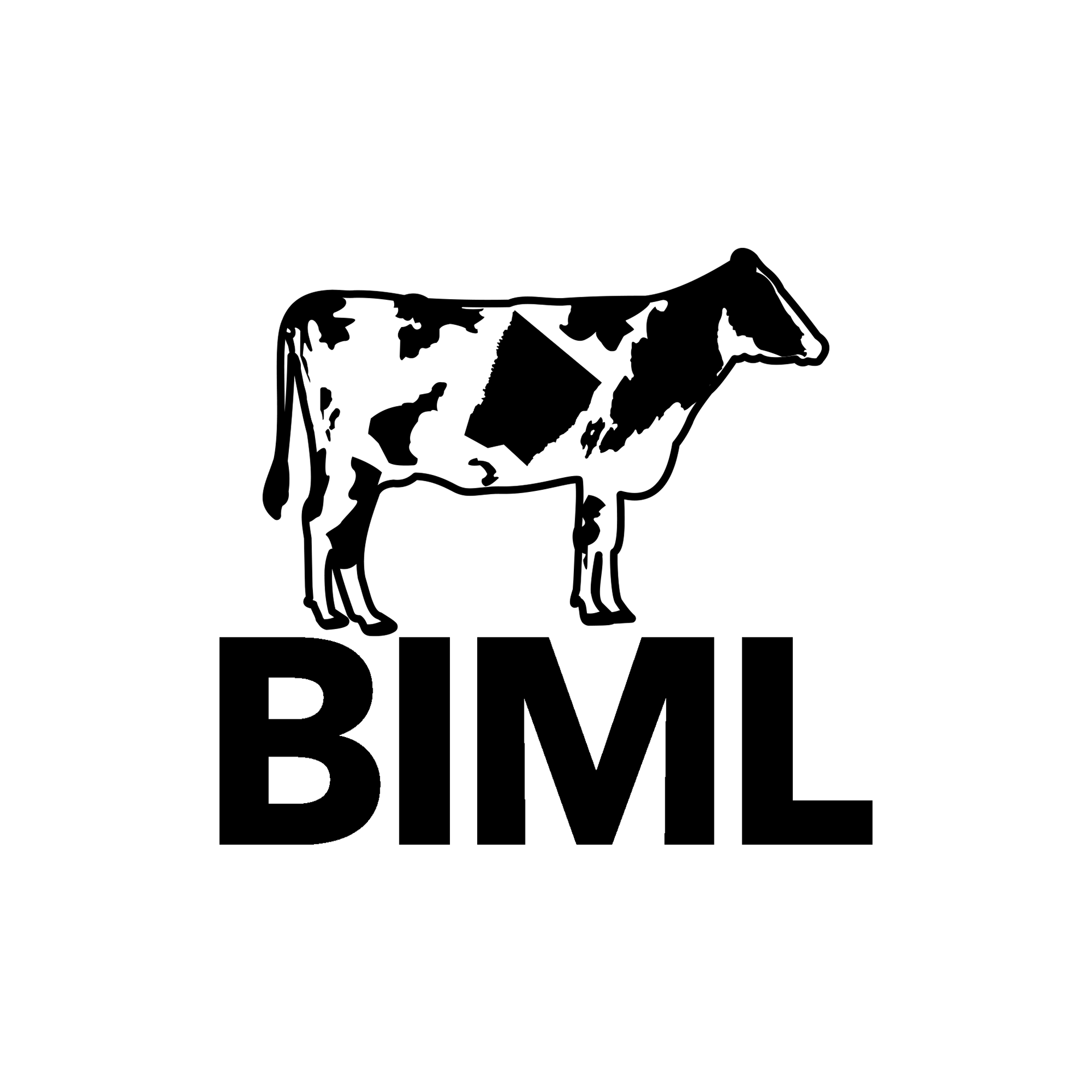
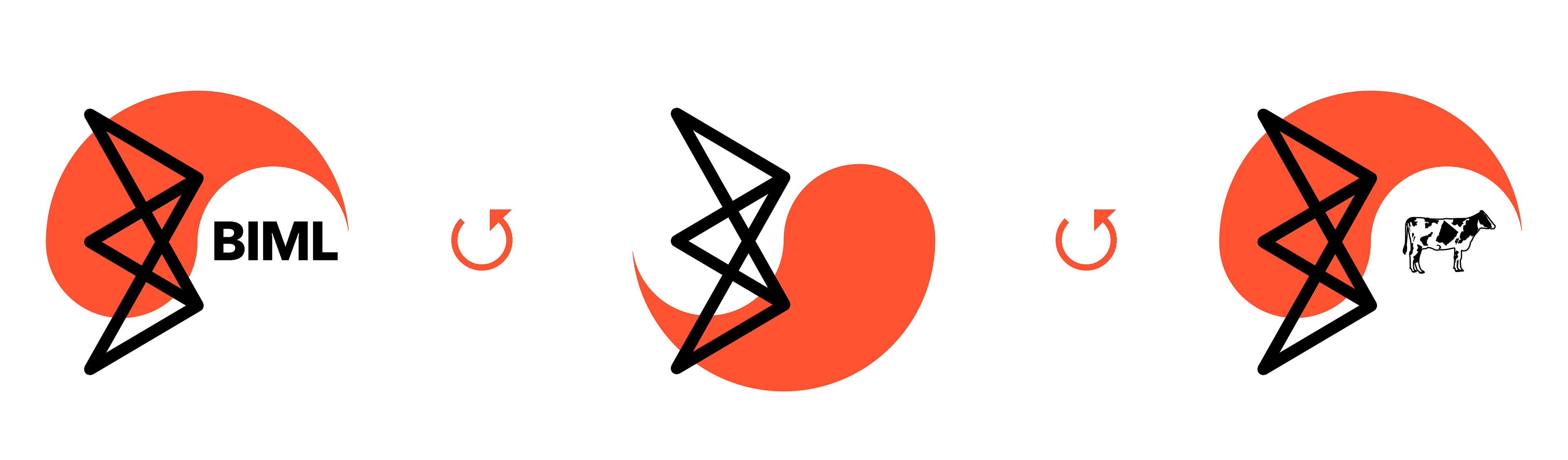
The BIML brand design process began with brainstorming ways to incorporate a yin-yang shape into the logo as specified by the client, and culminated in a dynamic mark built for multiple use cases and possible motion. The "B" icon alludes to the neural network layers that make up machine learning algorithms, and the cow features a splotch in the shape of Clarke County, Virginia.
Logo, brand, and website design.
The BIML brand design process began with brainstorming ways to incorporate a yin-yang shape into the logo as specified by the client, and culminated in a dynamic mark built for multiple use cases and possible motion. The "B" icon alludes to the neural network layers that make up machine learning algorithms, and the cow features a splotch in the shape of Clarke County, Virginia.
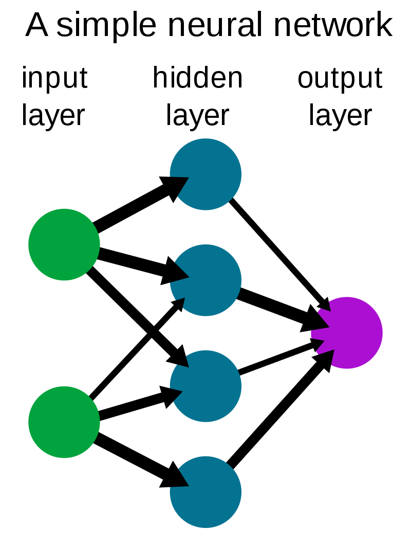
Source: https://en.wikipedia.org/wiki/Neural_network
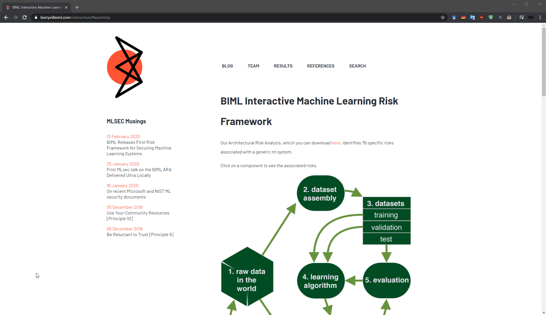
Collaborated with a software developer to realize a website with wordpress blogging support. Pictured left, an interactive framework rework utlising the site sidebar for cleaner navigation (unimplemented).
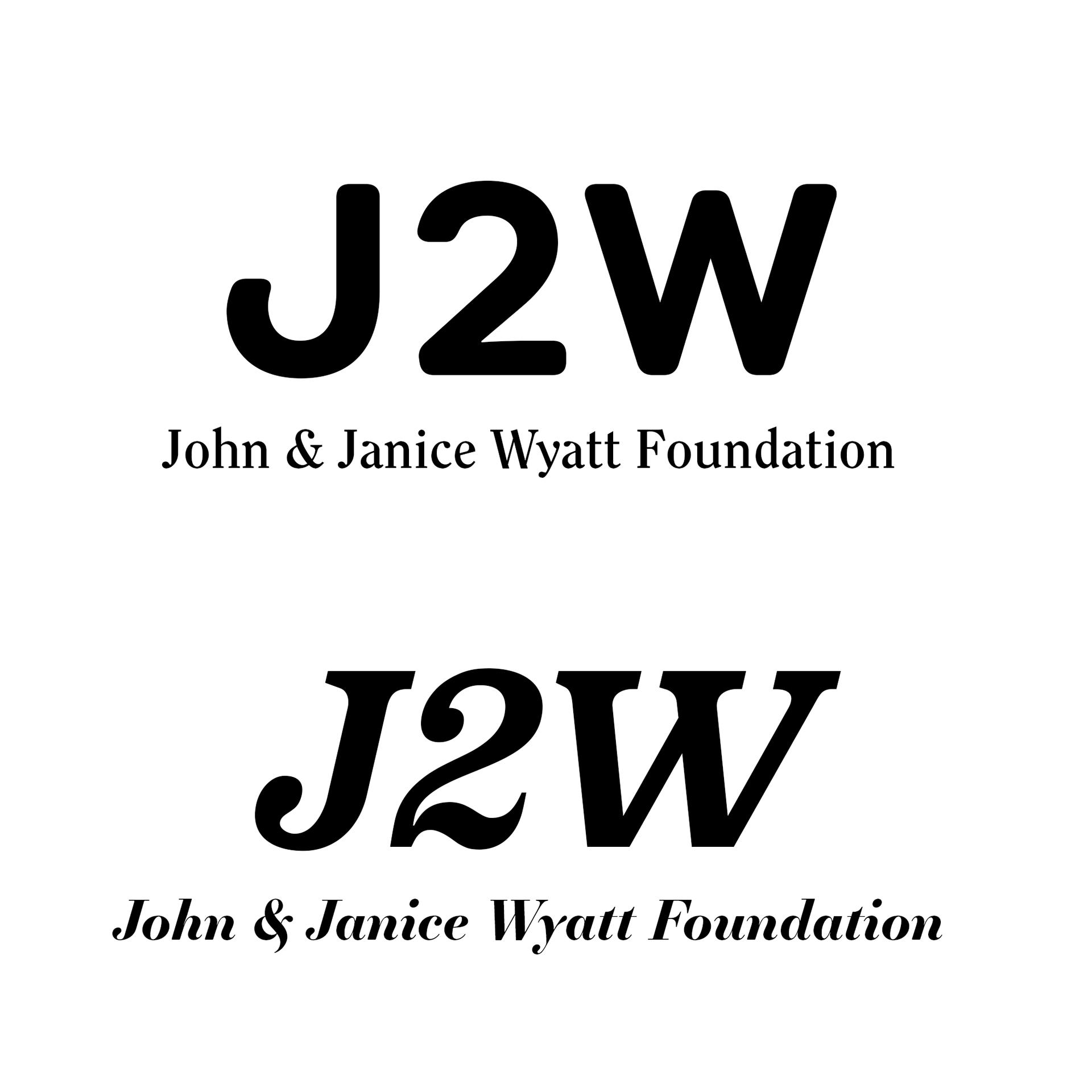
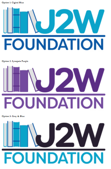
John & Janice Wyatt Foundation
Logo, motion graphic design.
Logo, motion graphic design.
The J2W foundation reached out to commission a logo, and provided feedback at every stage of of the process. The foundation chose to emphasize their playful and modern take on education philanthropy, and to ground the wordmark with a playful but familiar stack of books, while building on certain colors in a nod to the founder's past venture. J2W also reached out to request a motion graphic depicting their area of operation in the context of a globe.
Many colors, fonts, and icon elements were considered per client request.